Announcement

Collapse
No announcement yet.

USD wants new logo

Collapse
X
 
  • Filter
  • Time
  • Show
Clear All
new posts

  • #31
    Re: USD wants new logo

    Half of these created logos are better than the one released so YES it is proven that virtually anyone can come up with something better than what USD came up with. I like the Black U background example and really like the White U with the SD interlocked with the U. I think that is the nationally recognizable symbol much moreso that the newly proposed logo. Please USD come to your senses and scrap Lawrence & Schiller and their amaturish artwork. I ask where is Learfield in all of this. I would think this would fall under their scope of influence where they should be deciding who is going to design the new look. USD should not do anything without Learfields assistance and if this is USD's decision it's a bad one. Leave the marketing up to the pros.
    How Bout Them Yotes

    Comment


    • #32
      Re: USD wants new logo

      Originally posted by filbert View Post
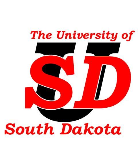
      About forty-five minutes with Visio (and its limited selection of fonts) yields:


      Yeah, it's minimal-effort, and far from perfect--or even adequate, IMHO. I think that's the point I'm trying to make. I hope USD hasn't actually sent a check to L&S . . .

      While I'm offering unsolicited advice, I think the coyote logo is too detailed--too busy--for a modern logo. (For that matter, I think the current generation of jackrabbit logos are on the borderline of being too detailed, too.) I'm also critical (given the benefit of hindsight) of the omission of the words "South Dakota" from any of the SDSU logos. (And yeah, it's awfully hard to fit "South Dakota" into any kind of logo without running into the too-detailed problem--or to just fit the long-ish name into a logo anywhere.)

      Turns out that most major media sports departments/organizations (I'm talking to you, ESPN) are staffed by idiots.
      Filbert,

      In all candor, that is very good. Since you are good at this stuff, I am wondering if you took (outh) from South and put it at the bottom of the S, and (akota) at the bottom of the D. What would that look like?

      The new logo they introduced was almost identical to what was the logo in late 60's-early 70's.

      Comment


      • #33
        Re: USD wants new logo

        Originally posted by Evolution Prime View Post
        I made these yesterday during the slow parts at work. First hand drawn then given a photoshop assist.


        Not much effort to come up with something of at least equal to what L&S came up with.
        I'd advise to keep your day job

        Comment


        • #34
          Re: USD wants new logo

          Originally posted by yoteforever View Post
          Filbert,

          In all candor, that is very good. Since you are good at this stuff, I am wondering if you took (outh) from South and put it at the bottom of the S, and (akota) at the bottom of the D. What would that look like?

          The new logo they introduced was almost identical to what was the logo in late 60's-early 70's.
          My opinion is that splitting up the words like that tends to look kind of goofy. And I guess I'll repeat my point that I'm not really good at this. I just have some time on my hands and a computer with Visio on it, and an opinionated bent of mind.

          L&S's SD logo would be much better IMHO if it went old-school all the way--use traditional collegiate block letters instead of the emaciated-looking ones that they put out there. As is, it's klnd of half-assed old-school, again IMHO. And it does look like a pretty blatant variation on the theme of Oklahoma's OU logo, as JimmyJack notes.
          "I think we'll be OK"

          Comment


          • #35
            Re: USD wants new logo

            filbert has designed a logo that is perfect IMO. I would wear something with that on it and for the helmets just the lettering and not the whole University of South Dakota thing on it works. good job.

            Comment


            • #36
              Re: USD wants new logo

              As far as the new Jackrabbit, even though it doesnt say South Dakota State University, just the Jackrabbit its very cool and I've found people like it. The football coach at Colorado College and his family loved it and wanted to know where they could buy the stuff and at the campground I've had a lot of people ask about it.

              Comment


              • #37
                Re: USD wants new logo

                Originally posted by yoteforever View Post
                I'd advise to keep your day job
                Something like this better then?

                Comment


                • #38
                  Re: USD wants new logo

                  Originally posted by SturgisJeff View Post
                  As far as the new Jackrabbit, even though it doesnt say South Dakota State University, just the Jackrabbit its very cool and I've found people like it. The football coach at Colorado College and his family loved it and wanted to know where they could buy the stuff and at the campground I've had a lot of people ask about it.
                  Don't get me wrong, I don't dislike the new rabbits, but I'm mainly just commenting on looking around at the ribbon scoreboards in Conseco Fieldhouse at the Women's Final Four, when they were showing all of the tournament qualifiers, and seeing that most of their logos are just simpler than the rabbit--the one they showed was the full galloping rabbit with the "Jackrabbits" underneath. It just didn't translate exceptionally well to the display in that format. The USD coyote logo is even more intricate, and would look even worse, IMHO.
                  "I think we'll be OK"

                  Comment


                  • #39
                    Re: USD wants new logo

                    Originally posted by Evolution Prime View Post
                    Something like this better then?

                    If you say so

                    Comment


                    • #40
                      Re: USD wants new logo

                      ....
                      Last edited by Evolution Prime; 04-10-2011, 04:19 PM. Reason: miscommunication

                      Comment


                      • #41
                        Re: USD wants new logo

                        I really like Filberts black "u" as a back drop ,and the red "sd" in the forefront,gives the whole logo an impression of having a little depth to it,rather than just looking flat.

                        Comment


                        • #42
                          Re: USD wants new logo

                          I too took a stab at this - using MS Word 2010. The font is Bank Gothic Medium. (20 min.)


                          And yes, this a direct rip-off of the work done by Evolution Prime. (Although I prefer to think of it as 'enhancement').
                          If you hold a cat by the tail you learn things you cannot learn any other way. - Mark Twain

                          Comment


                          • #43
                            Re: USD wants new logo

                            my quick play very simple, pick your favorite font...

                            Comment


                            • #44
                              Re: USD wants new logo

                              All the examples provided by board users prove that Lawrence and Schiller completely spaced off this project until 30 minutes before the deadline.
                              "Life is short so make sure you spend as much time as possible arguing with strangers on the Internet." - Person

                              Comment


                              • #45
                                Re: USD wants new logo

                                My suggestion would be to have the D hanging from the bottom rung of the S so the letters are directly on top of each other or it that looks tacky simply have them right next to each other no interlocking. Have that inside a U. Have the SD be red with black bordering around it. Have the U be white with a red bordering around it or something to that effect. Lettering looks better with bordering to create not such a plain look. If traditionalists just want red and white than border the red letter with white and visa-versa. USD shouldn't create a 60's looking logo in the modern times.

                                Better yet create about 4 different looks and allow the fans to vote on what they like. Afterall they are the ones that will be identifying with it and wearing it.

                                I gotta hand it to jacks fans here. They are making an honest attempt to come up with a good idea and not make it into a joke although I can see that down the road. Thanks for the graciousness.
                                How Bout Them Yotes

                                Comment

                                Working...
                                X