Announcement

Collapse
No announcement yet.

USD wants new logo

Collapse
X
 
  • Filter
  • Time
  • Show
Clear All
new posts

  • #16
    Re: USD wants new logo

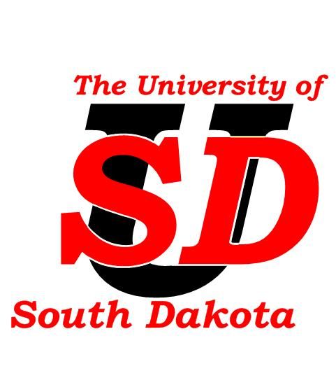
    So far I've heard it looks like the Padre's, the Sooner's, and Southern Cal's logo. I know their goal to get a nationally known brand, but, to me, this is not the way to go about it. People will scream that they ripped this off from somewhere else. Even their Udot campain seemed they ripped it off of Miama, only adding the "." to differentiate it.

    Seriously, I'm going to give a shot at soming up with something better than that when I get off my 12 hr shift tonight. It really can't be that hard to come up with something better.

    Comment


    • #17
      Re: USD wants new logo

      I think the logo makes some practical sense. Does it look attractive? Nope. But the concept seems better than that goofy U.

      I suppose the cutout on the S is to suggest which letter is overlapping the other letter (compare to the San Diego Padres logo which seems to have the D overlapping the S at that point). This should make for interesting party conversation.

      Reminds me of how much I really like our "strech" SD, whether it's in two colors or one solid color. Our stretch SD shows action and forward motion.

      I think USD accomplished it's main goal of improvement over the U. logo. Now they need to market correctly and make it work.

      Comment


      • #18
        Re: USD wants new logo

        I think USD is messing up bigtime, if they stay with this bland interlocking SD logo. It would be a New Coke moment, IMHO.

        Sure, you want to clean up the logo---the U-dot was pretty generic and meaningless on a national scale (and a rather lame and tardy play on the whole dot-com thing, actually), but within South Dakota, USD is in fact "The U."

        You HAVE to incorporate a U in the logo. You simply have to.

        I think objective, informed observers could be forgiven for thinking that SDSU's "stretch SD" logo has spooked them, or something.

        Within South Dakota, USD is "The U". Outside the state, it has to be "South Dakota." You need to take care of both sides of this branding need in the logo. I think SDSU has learned through the transition that you can't necessarily take in-state support for granted--you have to work to maintain, nurture, and increase that support. I'm not sure that this realization has quite sunk in with USD yet.
        "I think we'll be OK"

        Comment


        • #19
          Re: USD wants new logo

          Originally posted by BlueJayJack View Post
          I also beliebe there were some cheap shots aimed at STATE. just an observation....
          BlueJayJack, are you a Belieber?

          Comment


          • #20
            Re: USD wants new logo

            I think it was Herbster that's keeping the whole "SDSU wouldn't play us" alive. Sayler wasn't even in SD during the transition, and has no skin in that game.

            ---

            IMO, USD should've kept the stencil logo:

            http://www.usd.edu/medical-school/

            Was it dated? A bit. But it was recognizable.

            (also, I'm not a fan of SDSU's interlocking SD... but it's better than USD's)

            Comment


            • #21
              Re: USD wants new logo

              I think the new logo is an improvement on the U. logo. SD actually does mean something to most people. Unfortunately, it doesn't mean the same thing to everybody. There are only so many ways you can present an SD and make it look like the S comes before the D. I think the new logo is OK. I don't think you could ever convince me that any logo that represents USD is any better than OK.
              Finding is never about seeking. It is about opening yourself to what is already there. - Henry Meloux

              Comment


              • #22
                Re: USD wants new logo

                I can't believe that is seriously the effort of a graphic artist employed by L&S. I just typed SD on Word and looked at one of a million different fonts on my computer and it looked as good as that.

                I knew there were a lot of Yote alums in my new hometown, but I didn't realize how pathetic the support of their school really was.

                Comment


                • #23
                  Re: USD wants new logo

                  Why not have a big U in black with the S on the downslope of the U interlocking it and the D on the up slope of the U interlocking it. the S and D in red.

                  Comment


                  • #24
                    Re: USD wants new logo

                    Originally posted by MaddogJack View Post
                    I can't believe that is seriously the effort of a graphic artist employed by L&S.
                    I can. It's only marginally worse than the Sanford logo.

                    Comment


                    • #25
                      Re: USD wants new logo

                      Asside from the U with the dot next to it I actually like the current set of logos and designs that USD uses. This new SD looks stupid, plain, boring, without color, and just wrong. Why not add an "I" to the right of the logo and then you can have "Sucks Don't It".

                      I love the football helmets as they are now so when they change them to have the new SD on it the logo can match the sucktitude of the football team playing under it. SD can either stand for South Dakota or for "Sure Defeat".
                      How Bout Them Yotes

                      Comment


                      • #26
                        Re: USD wants new logo

                        I'll agree that the U logo is a pretty neat logo, however considering 49 states have a U of their state it is probably redundant for most of the country. I thought they might do what SDSU did and create a logo with the mascot for the national approach but keep the SD for in state, and helmets/uniforms

                        Comment


                        • #27
                          Re: USD wants new logo

                          With the new logo,the gal that wrote the nasty article about USD students not wearing school colors on campus shouldn't have anything to worry about - they will be standing in line at the bookstore when the new stuff comes out.

                          Comment


                          • #28
                            Re: USD wants new logo

                            About forty-five minutes with Visio (and its limited selection of fonts) yields:


                            Yeah, it's minimal-effort, and far from perfect--or even adequate, IMHO. I think that's the point I'm trying to make. I hope USD hasn't actually sent a check to L&S . . .

                            While I'm offering unsolicited advice, I think the coyote logo is too detailed--too busy--for a modern logo. (For that matter, I think the current generation of jackrabbit logos are on the borderline of being too detailed, too.) I'm also critical (given the benefit of hindsight) of the omission of the words "South Dakota" from any of the SDSU logos. (And yeah, it's awfully hard to fit "South Dakota" into any kind of logo without running into the too-detailed problem--or to just fit the long-ish name into a logo anywhere.)

                            Turns out that most major media sports departments/organizations (I'm talking to you, ESPN) are staffed by idiots.
                            "I think we'll be OK"

                            Comment


                            • #29
                              Re: USD wants new logo

                              I made these yesterday during the slow parts at work. First hand drawn then given a photoshop assist.


                              Not much effort to come up with something of at least equal to what L&S came up with.

                              Comment


                              • #30
                                Re: USD wants new logo

                                The Padres and Jackrabbits might appreciate the extra exposure USD's new logo will give them. USD's new logo is mediocre, at best, given the vast opportunity for improvement the creators had. At least the U. logo was unique. Maybe USD should have had a design contest for students instead of leaving the job to administrators and paid marketers.
                                This space for lease.

                                Comment

                                Working...
                                X