Announcement

Collapse
No announcement yet.

Mascot News

Collapse
X
 
  • Filter
  • Time
  • Show
Clear All
new posts

  • #46
    Re: Mascot News

    Originally posted by filbert
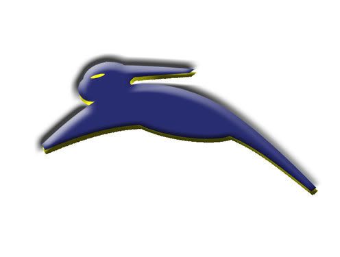
    Sure, it's just the design I've been playing with for a revamp of the overall look of the SDSUFans.com site, but you've got to admit, you can imagine seeing something like this on the side of a football helmet:


    Why can't some professional graphic artists at least get our school colors right?

    Best rabbit I've seen, I think you should submit that to the athletic department Filbert ;D

    Comment


    • #47
      Re: Mascot News

      Here is something a buddy of mine put together.  He's not known for his artistic abilities so I was quite impressed with this.  Let me know what you think.

      Comment


      • #48
        Re: Mascot News

        Simmer down people... Those versions aren't the final versions for them. And relax about the colors. These are just a blueprint for what they want them to look like. For non-engineers, this is like the foundation of a house. They will go off some of the feedback they get for 3 weeks and make some changes and then present some more versions. You build off the drafts, like you build up from the foundation. Eventually the school colors will be added to them. So grab a cold one, take some deep breaths and tell them what you like and don't like. I have talked with Micah and this is some of what he had to say. Don't be over critical about lack of school colors just comment on what features you like and don't like/

        Comment


        • #49
          Re: Mascot News

          Originally posted by SD-STATE
          [quote author=jackrabit1 link=1177610068/15#22 date=1178658320]My thoughts on the mascots...

          1) Too cherubic, like an illustration in a children's book.

          2) Better, but what is up with the ears? I've never seen a jackrabbit do that!

          3) I like this one... shows speed and aggressiveness. But I think they could show more musculature.
          #3 is my preference as well, #1 I could probably put up with, and #2 being just plain bad.[/quote]

          me too. I liked 3, but I could live with one.

          Comment


          • #50
            Re: Mascot News

            None of the above, all three stink, although the offical website poll does not allow you to express that comment, so I will do that here. I think we need to start from a likness of the actual animal and go from there. Photographs in my mind would be the starting place from which to make a copyrighted design and the final results should not be Bugs Bunny nor should it be something wierd like the three designs submitted recently and those before. I think we can find something that is resembles the actual animal but is not infringement on existing art.

            Comment


            • #51
              Re: Mascot News


              Here's what I think of when I think of a jackrabbit.

              Maybe form the musculature of its back thigh into a "S" and form the muscular of its forearm into a D.

              And stretch the rabbit out to make it appear that it is running.
              LET'S TAKE A TRIP TO BIRDLAND! http://www.youtube.com/watch?v=68-6O2mJhMw

              Comment


              • #52
                Re: Mascot News

                Originally posted by Haldersham
                None of the above, all three stink, although the offical website poll does not allow you to express that comment, so I will do that here. I think we need to start from a likness of the actual animal and go from there. Photographs in my mind would be the starting place from which to make a copyrighted design and the final results should not be Bugs Bunny nor should it be something wierd like the three designs submitted recently and those before. I think we can find something that is resembles the actual animal but is not infringement on existing art.
                I agree completely. Well said!

                Comment


                • #53
                  Re: Mascot News

                  Originally posted by BTownJack
                  Here is something a buddy of mine put together. He's not known for his artistic abilities so I was quite impressed with this. Let me know what you think.
                  We still need to worry about not looking like other rabbit logos. This might me to similar to Tomos (whoever that is) logo.

                  and Filberts kind of looks like VW rabbit logo.

                  Go State! Go State!

                  Comment


                  • #54
                    Re: Mascot News

                    I'm not very excited about any of them.  I would favor #1 then #3 and would never ever buy anything with the #2 logo on it.  

                    Comment


                    • #55
                      Re: Mascot News

                      Originally posted by BTownJack
                      Here is something a buddy of mine put together. He's not known for his artistic abilities so I was quite impressed with this. Let me know what you think.

                      I actually like this design.........it would look better with letter and font work but I think the rabbit looks cool about as cool as you can make a rabbit look.

                      Comment


                      • #56
                        Re: Mascot News

                        This one's my pick and an easy choice. The third one is way too stylized (are those flippers or paws?) The second one would work as a complementary, secondary logo to the first. But the first one is by far the best. I encourage you to click on them and get a closer look on the SDSU Web site. The small thumbnails aren't as helpful as looking at the full-sized logo. This one is the closest to what I saw way back when and I liked it then, too. It has depth. It won't be outdated in 15 minutes. It is mindful of some of the very old stretched-out rabbits of the past. He looks tough and fast. Works on its own or (better) with the text. What we need here is a logo that will last a good long time. Of the three, this is the one that wouldn't instantly be outdated or clichéd.

                        Holy nutmeg!

                        Comment


                        • #57
                          Re: Mascot News

                          Originally posted by JimmyJack
                          This one's my pick and an easy choice. The third one is way too stylized (are those flippers or paws?) The second one would work as a complementary, secondary logo to the first. But the first one is by far the best. I encourage you to click on them and get a closer look on the SDSU Web site. The small thumbnails aren't as helpful as looking at the full-sized logo. This one is the closest to what I saw way back when and I liked it then, too. It has depth. It won't be outdated in 15 minutes. It is mindful of some of the very old stretched-out rabbits of the past. He looks tough and fast. Works on its own or (better) with the text. What we need here is a logo that will last a good long time. Of the three, this is the one that wouldn't instantly be outdated or clichéd.

                          This one is no good either. We need to do better than this.

                          Comment


                          • #58
                            Re: Mascot News

                            http://www.argusleader.com/apps/pbcs...42/1002/SPORTS

                            SDSU presents logo options
                            School collecting opinions to make decision by 2008


                            By Melanie Brandert
                            mbrander@argusleader.com
                            Published: May 10, 2007

                            South Dakota State University students, faculty, alumni and others now can get involved in the choice of the next Jackrabbit logo.

                            The logo committee is seeking opinion from the university community and public on various looks of three designs created by New York-based Phoenix Design Works. In this latest set of designs, the logo committee sought some that were more abstract and less cartoonish.

                            Jenny Crickard, university relations director, said the committee wanted three distinct designs on which input could be received.

                            "One is more traditional. One is more stylized, and one is more abstract," she said. "We will end up taking everyone's comments that choose to leave them and use those to refine designs into something that will represent the university."

                            Last fall, SDSU hired Phoenix Design Works to come up with a new logo. The company has designed mascots and logos for universities in Louisiana, Arkansas and Massachusetts.

                            SDSU officials are looking for a logo with speed, agility and strength - a more athletic version of a jackrabbit, sports information director Jason Hove has said. . . . (read more)


                            Go State!

                            Comment


                            • #59
                              Re: Mascot News

                              Originally posted by Jacks02
                              [quote author=filbert link=1177610068/30#35 date=1178685468]Sure, it's just the design I've been playing with for a revamp of the overall look of the SDSUFans.com site, but you've got to admit, you can imagine seeing something like this on the side of a football helmet:


                              Why can't some professional graphic artists at least get our school colors right?

                              Best rabbit I've seen, I think you should submit that to the athletic department Filbert  ;D[/quote]
                              I agree! It is really very good. Send it in! Lets start a grass roots movement for Filberts rabbit!

                              Comment


                              • #60
                                Re: Mascot News

                                Originally posted by HoboD
                                [quote author=Jacks02 link=1177610068/45#45 date=1178729340][quote author=filbert link=1177610068/30#35 date=1178685468]Sure, it's just the design I've been playing with for a revamp of the overall look of the SDSUFans.com site, but you've got to admit, you can imagine seeing something like this on the side of a football helmet:


                                Why can't some professional graphic artists at least get our school colors right?

                                Best rabbit I've seen, I think you should submit that to the athletic department Filbert ;D[/quote]
                                I agree! It is really very good. Send it in! Lets start a grass roots movement for Filberts rabbit![/quote]
                                I actually did send it to Fred O. who said he'd pass it along. I'm under no delusions that I'm a real graphic artist, though. (I did however offer very, very favorable licensing terms )
                                "I think we'll be OK"

                                Comment

                                Working...
                                X