Re: New SDSU Football Stadium Site Plan
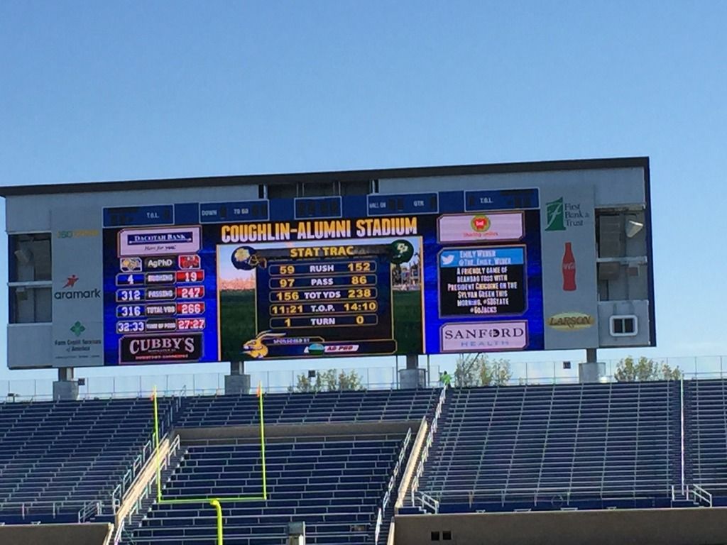
I really didn't notice the three windows at the top until it was mentioned on this board. I'm more concerned with the uncovered speakers. Those areas stand out more to me.
The windows on the top would be less noticeable if they would have used a black background for the advertising versus the white. The black windows would have blended in. Another benefit with a black background is that it would have made the video portion appear brighter. With the white background, your eye's iris has to compensate for the brighter white background.

Looks like they will have tons of information they can post on the board. I'm curious if they will incorporate the Twitter feed as included above. (I don't like the Stat Trac example they tested in this photo. It is showing Cal Poly out performing us. )
)
Photo courtesy of WestSideRabbit.
I really didn't notice the three windows at the top until it was mentioned on this board. I'm more concerned with the uncovered speakers. Those areas stand out more to me.
The windows on the top would be less noticeable if they would have used a black background for the advertising versus the white. The black windows would have blended in. Another benefit with a black background is that it would have made the video portion appear brighter. With the white background, your eye's iris has to compensate for the brighter white background.

Looks like they will have tons of information they can post on the board. I'm curious if they will incorporate the Twitter feed as included above. (I don't like the Stat Trac example they tested in this photo. It is showing Cal Poly out performing us.
 )
)Photo courtesy of WestSideRabbit.

Comment